
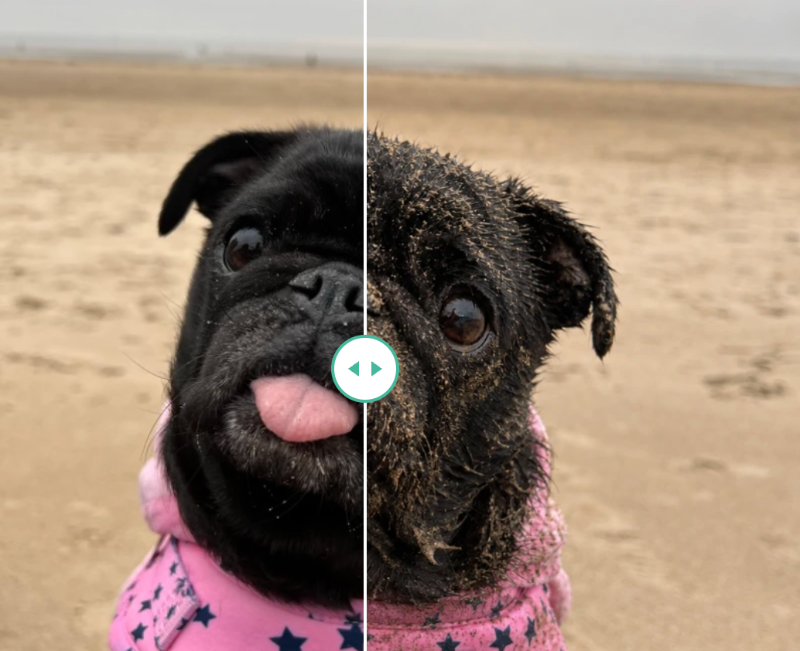
What a very sandy pug can teach you about before & after sliders
 Before the beach
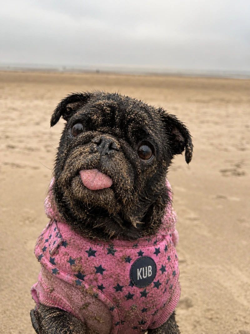
After the beach
Before the beach
After the beach
Love them or hate them, before and after sliders are making a comeback
These were absolutely everywhere about ten years ago. Every agency website had one. The trouble was, half of them were comparing two barely different stock photos, or a “before” that had clearly been made to look as grim as possible so the “after” had something to beat.
So they got overused, they started to look a bit naff, and people quietly went off them.
Which is exactly why they work again now. They’re rare enough to feel like a nice little surprise, and when the photos are honest they do something no amount of clever writing can pull off. You just have to earn it.
The one I built recently
I built one of these for a company that strips old paint, rust and coatings back off classic cars and industrial parts. Absolutely perfect fit, because their whole service is the difference between the two photos. Flaking, corroded, forty year old component on one side. Clean bare metal on the other.
Now, you can write three paragraphs explaining their process, and people will skim it. Or they can drag a handle and go “oh, right, got it”. Two seconds, no reading, decision basically made.
That’s when a slider is genuinely worth having.
So when should you use a before & After slider?
The short version.. when the thing you’re selling is the change.
That’s a lot of businesses. Restoration and stripping, valeting, driveway and render cleaning, landscaping, decorating, joinery, dentistry, hair, photography, and yes, website redesigns.
It’s also brilliant when someone’s a bit nervous about spending the money. The bigger the job, the more people quietly want proof instead of promises. Pop the slider right next to the boldest claim on your page and it stops being marketing and starts being evidence.
And they’re a little bit addictive, if I’m honest. People drag them, then drag them again. That’s a few extra seconds on your site where you’re deciding exactly what they’re looking at, which is not nothing.
When I would talk you out of one
I’d genuinely rather tell you no than build you something that makes your work look worse than it is. So I’d steer you away if:
- The two photos don’t match. Different angle, one gloomy phone snap and one nicely lit shot. The slider will drag people’s eyes straight to the mismatch. At best it looks a bit careless, at worst it looks like you’re hiding something.
- The change is subtle. If people have to squint, you want a close up with a caption instead.
- The result is a number, not a picture. Cheaper bills, faster site, more enquiries. That wants a big bold figure, not a slider.
- You’ve only got one decent photo. Please don’t force it. Everything else in the frame will get picked apart.
- You just fancy something that moves on the homepage. Two stock photos won’t fool anyone, and people can absolutely tell.
One or two, placed exactly where people are having doubts, will beat a page full of them every single time.
Getting the photos right, which is honestly the whole job
This bit happens before I’m involved, and it decides whether the finished thing sings or flops.
- Take the before photo before you start.
- Mark where you stood. Tape on the floor, a paving slab, a wheelie bin, whatever. Same spot, same height, same phone.
- Match the light. Same time of day outside, same lights on inside. Overcast is your friend, as Frankie ably demonstrates.
- Shoot a bit wider than you need. Gives me room to crop both to identical framing afterwards.
- Get a wide one and a close up. The close up is usually the more convincing of the two.
- Send me the originals. Not screenshots, not the WhatsApp version. The proper full size files.
Do that and you’ll have something worth putting on your homepage. And a phone is completely fine, by the way. Frankie was shot on one.
“Can’t you just stick a plugin on?”
I could. I don’t, and the main reason is speed.
Nearly all of these plugins load their code on every single page of your website, whether that page has a slider on it or not. So your contact page, your blog posts, your services pages, all quietly carrying extra baggage for something that appears once. On its own it’s not a disaster. But this is exactly how websites end up slow: ten or twelve plugins all adding “just a tiny bit”. And Google does measure how fast your pages load, and it does feed into where you show up.
There’s other stuff too. It’s another plugin to keep updated, another thing that can fall out with something else. Loads of the before and after plugins in the WordPress directory haven’t been touched in years, and when one finally packs in, the slider on your homepage turns into an empty box or a line of stray text. Usually on a Friday.
So for a slider or two on a site, I just write it. It’s a small bit of code, I control all of it, it only loads on the page that actually needs it, and there’s nothing to be abandoned by.
If you were planning to add a brand new slider yourself every week then that changes the maths and a plugin earns its keep. Most people aren’t.
Little things that are easy to get wrong
Whoever builds yours, these do matter:
- It needs to work on a phone, with a thumb, not just with a mouse.
- It needs to work for someone using a keyboard instead of a mouse, and carry proper image descriptions for screen readers and for Google.
- Both photos load at once, so they need compressing properly. A badly built slider is one of the quickest ways to tank your page speed.
- It should hold its space while it loads, so the page doesn’t jump about while someone’s reading.
Plenty of the off the shelf ones get at least one of those wrong.
The short version
A before and after slider is proof, not decoration. They went out of fashion because people used them as decoration. Used properly they’re brilliant.
So use one where a customer is quietly wondering whether it’ll really look like that when you’re finished. Give it two photos taken from the same spot in the same light. Stick it right next to the claim it’s backing up.
Get the photos right and it’ll do more selling for you than a whole page of copy.
If you reckon your business has a proper before and after in it somewhere, and you’re not sure whether your photos are up to it, send them over and I’ll tell you straight.

By Bec Lee
Bright Website Design
Bec is the founder of Bright Website Design, a Wilmslow-based website design agency specialising in building beautiful, high-performing WordPress websites for small & medium businesses.
With a reputation for being straightforward, technically sharp, and genuinely invested in her clients’ success, Bec has built websites for businesses of all shapes and sizes, from local Cheshire traders to companies operating across Europe.


